

Comcast Frictionless Portal Redesign
Project Overview
The Comcast Frictionless Portal is an internal Salesforce-powered platform that allows corporate partners to manage, upgrade, and add services for their clients. The previous interface had usability issues, making navigation difficult and hindering efficiency when partners attempted to upgrade services.
Challenge
The existing portal had complex navigation, a cluttered UI, and an unintuitive process, making it difficult for partners to perform essential actions like upgrading services and managing client accounts. The redesign needed to:
- Simplify the user journey for adding and upgrading services.
- Enhance navigation to make Salesforce more intuitive for non-technical users.
- Improve efficiency to reduce friction and increase adoption.
Role: UX Designer & User Experience Architect
As the UX Designer, I was responsible for reimagining the Frictionless Portal to ensure a seamless experience for corporate partners. This involved:
- Understanding business requirements by working directly with Product Owners.
- Identifying pain points in the current Salesforce-based interface.
- Designing an intuitive interface with a simplified service management flow.
- Collaborating with developers to ensure the new UI was implemented effectively.
Key User Flow Enhancements
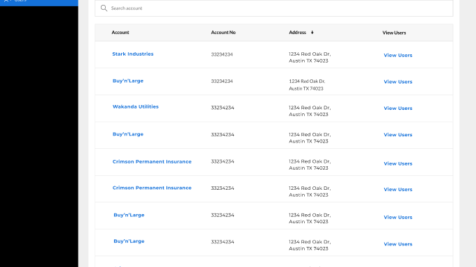
1. Simplified Navigation & Dashboard Experience
Problem:
- Users struggled to find key features like service upgrades and client management.
Solution:
- Redesigned dashboard with a clear hierarchy of functions.
- Consolidated features into intuitive menus and quick-action buttons.
- Predictive search & filtering to help users find accounts/services faster.
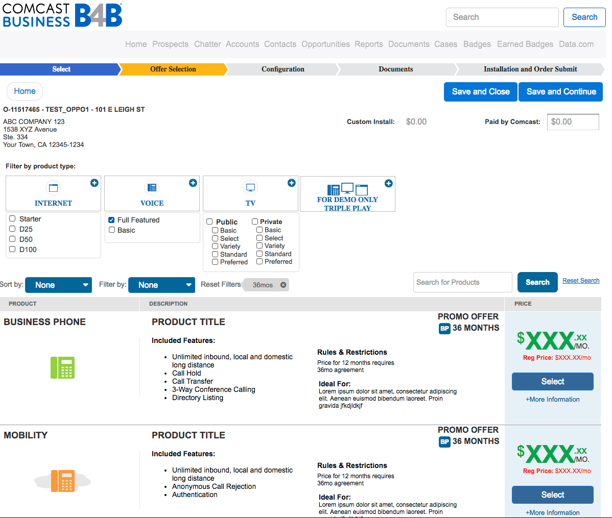
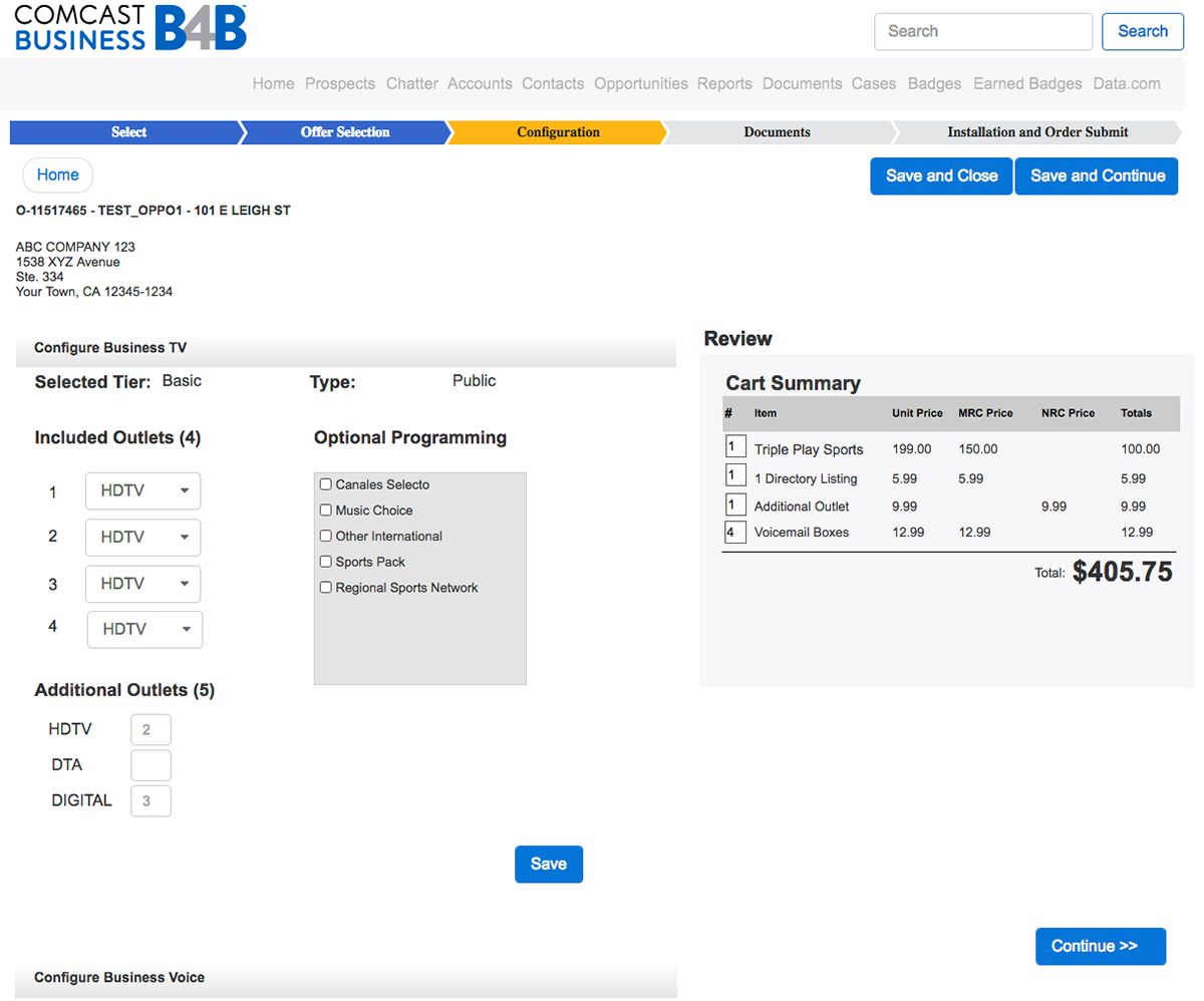
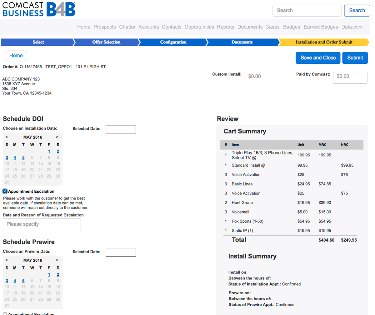
2. Streamlined Service Upgrade Process
Problem:
- The process to upgrade a client’s service was multi-step and confusing.
Solution:
- Designed a one-page upgrade flow with clear progress indicators.
- Integrated auto-suggestions for recommended upgrades.
- Created a real-time cost estimator so partners could see price impacts instantly.
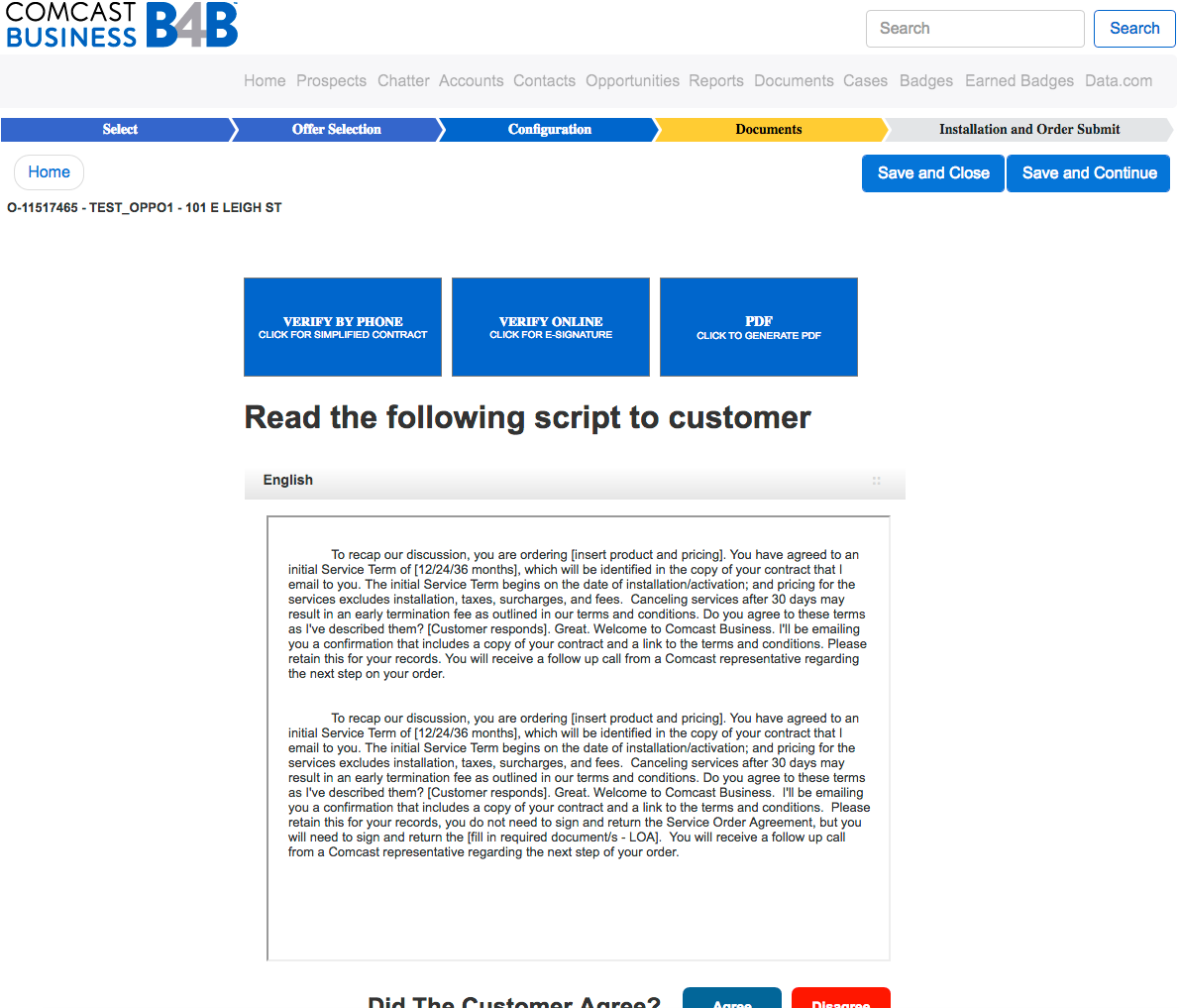
3. Salesforce Integration Optimization
Problem:
- The previous UI did not align well with Salesforce’s workflow, causing inefficiencies.
Solution:
- Mapped Comcast’s business logic to Salesforce’s native capabilities.
- Introduced smart form fills and auto-sync features to reduce manual data entry.
- Ensured a consistent UI/UX aligned with Salesforce best practices.
Challenges & Solutions
Challenge/UX Solution
Salesforce’s default UI was too complex for non-technical users.Redesigned the interface with custom UI components tailored for corporate partners.
Partners had trouble navigating and managing client accounts.Introduced intuitive navigation, predictive search, and a centralized dashboard.
The upgrade process was time-consuming and unclear.Condensed it into a streamlined, guided step-by-step flow.
Users were hesitant to adopt the new interface.Conducted usability testing and iterated designs based on feedback to ensure smooth adoption.
Final Outcome
The redesigned Comcast Frictionless Portal successfully addressed usability pain points, making it easier for corporate partners to navigate Salesforce, upgrade services, and manage client accounts efficiently.
Results
✅ New designs have been fully developed and are now in production.
✅ Corporate partners report a more seamless and intuitive experience.
✅ Reduced time required to complete upgrades & manage accounts.
✅ Corporate partners report a more seamless and intuitive experience.
✅ Reduced time required to complete upgrades & manage accounts.