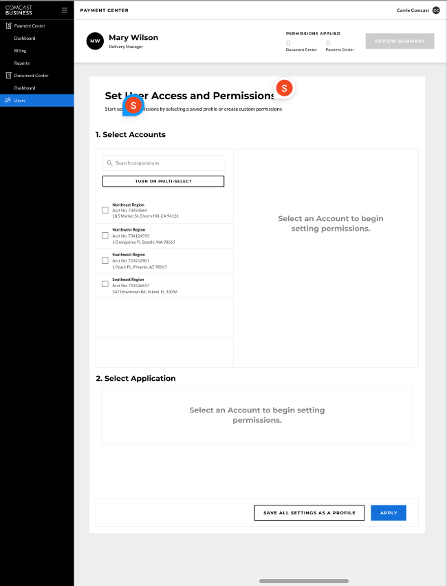
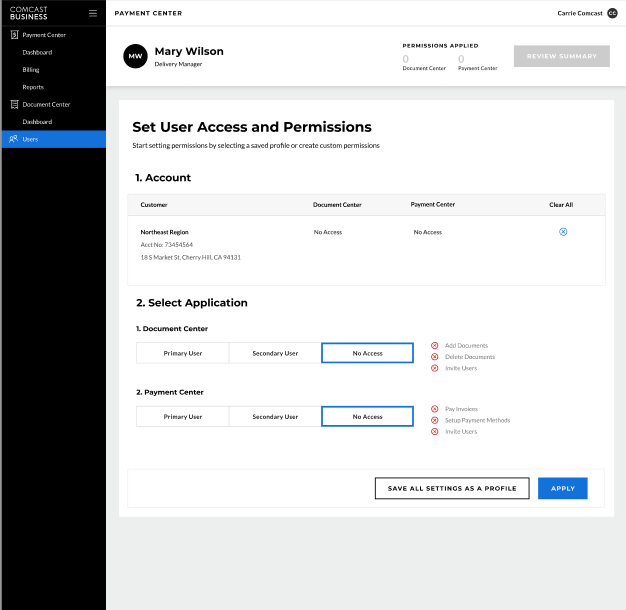

Comcast - Doc Center - Redesign
Redesigning Comcast’s FIS Payment Center for a Seamless User Experience
Client: Comcast (via TATA Consultants)
Industry: Telecommunications / Financial Services
Role: UX/UI Designer
Problem Statement:
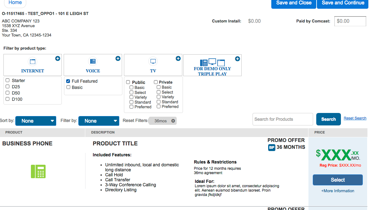
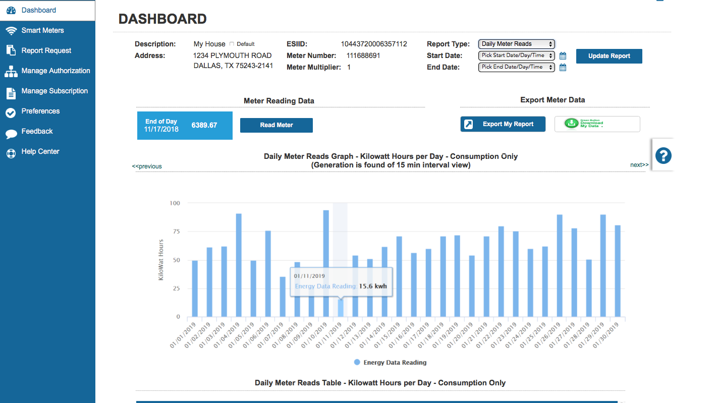
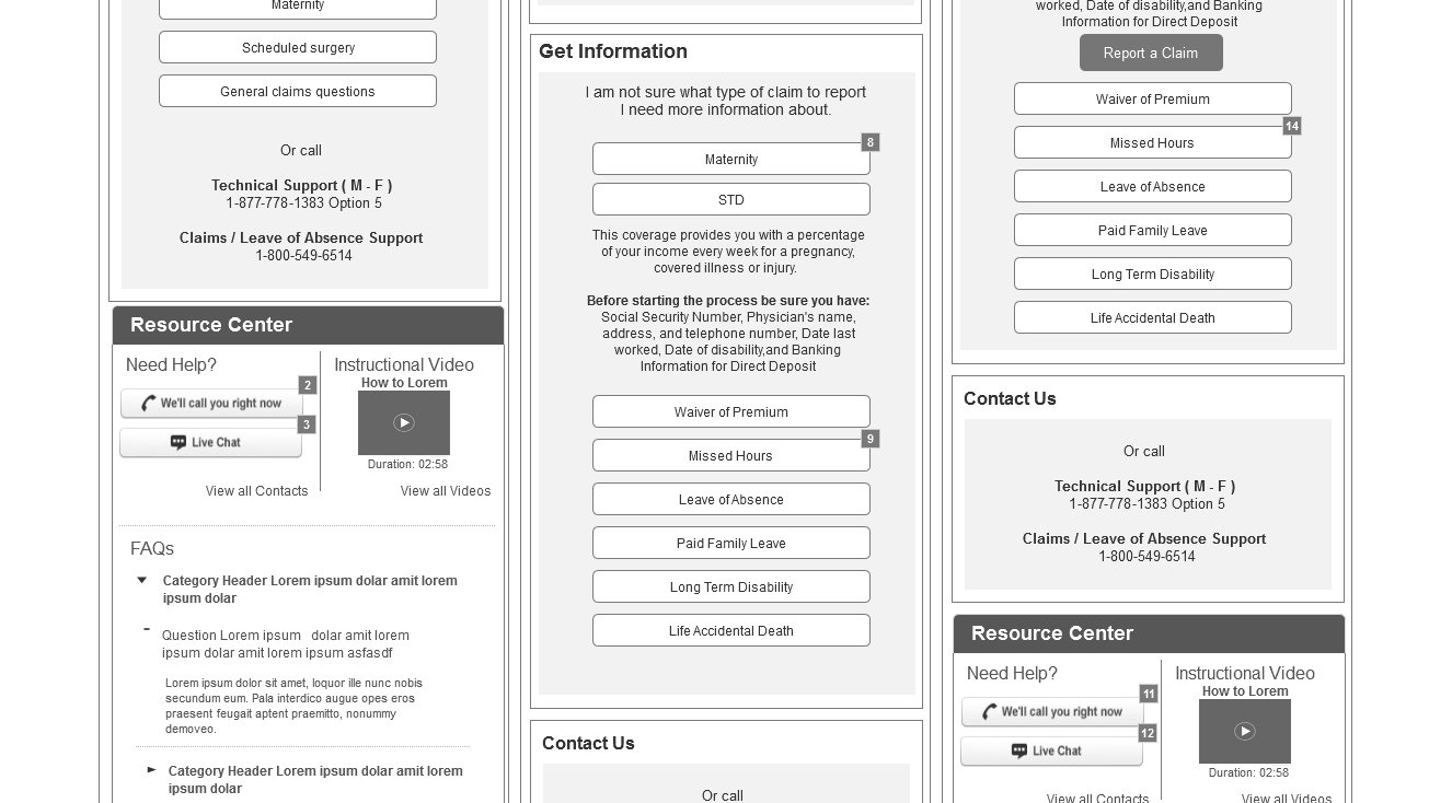
The FIS Comcast Payment Center needed a more intuitive and user-friendly interface to integrate EAC and My Account features. Users struggled with navigation and lacked a seamless payment experience. Solution: Led a full redesign using Figma and Sketch to create modern, easy-to-use interfaces. Implemented Material Design frameworks and Angular-based UI components for better responsiveness. Conducted usability testing and iterative design cycles to refine interactions.
Solution:
✅ Data-Driven UX Research: Analyzed user pain points through heatmaps and user behavior analysis.
✅ Component-Based Design Approach: Created scalable and modular design systems for easier future updates.
✅ Agile & Iterative Development: Worked closely with developers to ensure smooth implementation.
Results:
💳 20% decrease in payment process completion time, reducing friction for users.
📈 Increased user satisfaction scores by 35% based on feedback surveys.
🔄 Higher customer retention due to a more efficient and accessible payment process.
